Newbie question (Unchecking Components)

Kurushi

New Member
Hey, first post and proud owner of the full version of NTLite.

I have a bit of a newbie question. Not really sure how I'd search for this so apologies if it's been asked 100 times.

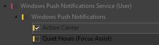
If I remove a (yellow) 'child' branch of a red component, making the parent (red) box untick - is that 'breaking' the parent (red) component or is it just visual? Are all the child components required to make the parent work or do they often limp along with not much fuss? Example below. Will removing quiet hours completely stop all push notications? I'm guess the answer depends :D Cheers

1707955461691.png
 
This is a good question which hasn't been covered in recent threads.

NTLite has color codes to mark if a component is member of an existing Components removal template. The templates are colored from Green to Red, based on the probability of breaking key Windows features when used. A Red colored component is more likely to cause problems by removing a feature that is often used or visible to the user.

Components are arranged in a tree-based hierarchy, based on dependency needs. Which higher level features are dependent on lower level features in order to work.

For example, Windows Push Notifications (as a feature) require the Push Notifications Service to operate. Unchecking Push Notifications Service would prevent Action Center from working correctly. When NTLite knows this will cause a chain reaction, it creates a pop up message to warn you what other components will break because of your choices.

Disabling Quiet Hours by itself will only break Quiet Hours, because it's dependent on Push Notifications (and Service). But it doesn't work in the reverse order, Push Notifications can work without having Quiet Hours around.

If you see the checkbox change to a partially grey box, it means partial functionality is lost due a dependency.

Any time you feel that you've messed up changes, click the Reset icon in the Toolbar to revert all edits on the Components page.
 
Checkboxes have 3 states:
- Checked
- Unchecked
- Semi-checked/Gray/Indeterminate, this one just means that a child under them is unchecked, they are not affected by it

Interesting view, especially in your screenshot, indeed due to selection of the unchecked item, it looks like parents are also unchecked.
But if you move the selection from the Quiet Hours, you'll see that it looks fully unchecked, while parents are not.

The purpose of it is to see that something under main branches is unchecked. Otherwise if all kept items are always checked, you would not easily see where the unchecked item is.

You can Start - Run:
OptionalFeatures
and practice there to get the hang of it. Each theme has a different style to it, I might change this semi-checked to a dimmed checkbox or something, wrote it down for later.

Here is the official Microsoft explanation.
"When options can be grouped, you can use an indeterminate check box to represent the whole group. Use the check box's indeterminate state when a user selects some, but not all, sub-items in the group."

Thanks.
 
Makes sense, thanks for clarifying both of you.. At least I know it's "safe" (and I use that word lightly) that the parent is not entirely dependent on the child componets.

I am wondering if it's my default NTLite theme or my desktop settings (LTSC 2019 Dark theme) but I can't see it very well. It's a lot more obvious on the light theme. Anyway, the look isn't too important to me - as long as I know what's happening now - thanks! :)

1708035355177.png1708035688201.png1708035707930.png
 

Attachments

  • 1708035380377.png
    1708035380377.png
    4.5 KB
Makes sense, thanks for clarifying both of you.. At least I know it's "safe" (and I use that word lightly) that the parent is not entirely dependent on the child componets.

I am wondering if it's my default NTLite theme or my desktop settings (LTSC 2019 Dark theme) but I can't see it very well. It's a lot more obvious on the light theme. Anyway, the look isn't too important to me - as long as I know what's happening now - thanks! :)

View attachment 11314View attachment 11316View attachment 11317
Thanks for that, will fix the dark theme, indeed the unchecked looks like semi-checked.
 
Improved in the latest beta (v2024.3+), let me know if all good now.
Thanks.
 
Much more visble. Great to see such 'on the spot' development! :)

As a side note, I did like your idea of putting something in the box but this is certainly not a feature request :p

Thanks!
 
Checkboxes have 3 states:
- Checked
- Unchecked
- Semi-checked/Gray/Indeterminate, this one just means that a child under them is unchecked, they are not affected by it

Interesting view, especially in your screenshot, indeed due to selection of the unchecked item, it looks like parents are also unchecked.
But if you move the selection from the Quiet Hours, you'll see that it looks fully unchecked, while parents are not.

The purpose of it is to see that something under main branches is unchecked. Otherwise if all kept items are always checked, you would not easily see where the unchecked item is.

You can Start - Run:
OptionalFeatures
and practice there to get the hang of it. Each theme has a different style to it, I might change this semi-checked to a dimmed checkbox or something, wrote it down for later.

Here is the official Microsoft explanation.
"When options can be grouped, you can use an indeterminate check box to represent the whole group. Use the check box's indeterminate state when a user selects some, but not all, sub-items in the group."

Thanks.
If I understand correctly gray marked components without a color code are indifferent (can be marked or unmarked). Am I right?
 

Attachments

  • Capture.PNG
    Capture.PNG
    6.8 KB
If I understand correctly gray marked components without a color code are indifferent (can be marked or unmarked). Am I right?
Gray colored components are locked by Compatibility mode.

You need to read the Extra info column, and uncheck the Compatibility mode protecting it from removals. This is done to prevent accidental removals of important dependencies.

Capture.PNG
 
Gray colored components are locked by Compatibility mode.

You need to read the Extra info column, and uncheck the Compatibility mode protecting it from removals. This is done to prevent accidental removals of important dependencies.

View attachment 11660
I know that thank you very much. To be more clear I posted another picture.
In this picture there are no colored components. One component is blocked by compatibility issue and some other ones marked by warnings. That components have only warnings and with no any color code and are indifferent (can be marked or unmarked by me). It's my choice to take into account the warnings or not.
 

Attachments

  • Capture.PNG
    Capture.PNG
    20.5 KB
The checkbox's color bar represent which default (removal) template they belong to. Because the templates are graded from safest to unsafe, they can be used to judge the risk of removing this component.

Device drivers, on the other hand, don't belong to any default templates and therefore get no color bars. NTLite has no way to judge if you need a particular driver for a target PC, other than protecting the minimum required drivers in gray color.
I know that thank you very much for your time. I posted the picture and my explanation to it for example only. Thank you again for your time.
 
Back
Top