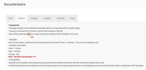
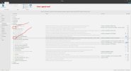
It's been so long since I have used NTLite that the new Template feature in the Components "Tab" was confusing to me. (Especially its color codes. "Red" usually means "Danger." (At least in the World of Aviation.) Which had me worried that I was removing something that I shouldn't.)
So, first things first:
I finally went to the Documentation page to learn about Templates.
Two corrections needed here:

1) A grammar typo. "is" should be "are."
2) There is no description for the template color "Red."
But there is a red color in the Components page.

So the Description should be added.
Okay, now a few observations/recommendations:
1) I don't understand the label for Red, "Not Recommended."
Does this mean "Not Recommended to Remove"? Or does it mean "Not really needed (even for Compatibility)"?
Since Red is at the bottom of the list, I infer that Red really means "Not really needed" and is Safe to Remove.
If so, if it's safe, then shouldn't it be colored Green?
(I realize that there are only so many colors, and fewer still which display nicely on a computer screen.)
But I'm also confused as to how something can be safe to remove but at the same time be "Locked by Compatibility." (Which, apparently the Red Template overrides. Perhaps that explains "Red" for "Danger"?)
2) Whatever, I suggest that a Legend of the colors be shown on the page, to make it clear to new users what the colors are about. (I had to look in Documentation to learn about the colors and Templates.) Perhaps a permanent Legend at the top of the window titled "Colors of Templates"? That might get me clicking on the Template 'button' on the Components page?
So, first things first:
I finally went to the Documentation page to learn about Templates.
Two corrections needed here:

1) A grammar typo. "is" should be "are."
2) There is no description for the template color "Red."
But there is a red color in the Components page.

So the Description should be added.
Okay, now a few observations/recommendations:
1) I don't understand the label for Red, "Not Recommended."
Does this mean "Not Recommended to Remove"? Or does it mean "Not really needed (even for Compatibility)"?
Since Red is at the bottom of the list, I infer that Red really means "Not really needed" and is Safe to Remove.
If so, if it's safe, then shouldn't it be colored Green?
(I realize that there are only so many colors, and fewer still which display nicely on a computer screen.)
But I'm also confused as to how something can be safe to remove but at the same time be "Locked by Compatibility." (Which, apparently the Red Template overrides. Perhaps that explains "Red" for "Danger"?)
2) Whatever, I suggest that a Legend of the colors be shown on the page, to make it clear to new users what the colors are about. (I had to look in Documentation to learn about the colors and Templates.) Perhaps a permanent Legend at the top of the window titled "Colors of Templates"? That might get me clicking on the Template 'button' on the Components page?
